
Best Practices for Wayfinding Signs

Making the Right First Impression
It doesn’t matter if you have an award-winning team and the world’s best service, if your customers cannot easily find where they need to go, they’re going to be annoyed when they get there, if they arrive at all.
Most of us have had a frustrating experience with a customer service phone call. After wasting time moving through layers of an ineffective phone tree, it doesn’t matter how helpful the service is when we finally speak to a human, we’ve formed a negative opinion about the company.
Just as moving through a non-functioning phone tree makes a company seem disorganized, missing or ineffective wayfinding signage gives your visitors a less than positive impression. The difference is that signage is silent, constant, and immediate. People begin forming opinions about your organization the moment they step onto the property, and clear navigation plays a direct role in whether that impression is positive or frustrating.
A strong wayfinding system reduces stress for visitors and also helps staff. When people can find their destination without asking for help, front desks, reception areas, and security teams can focus on higher-value tasks instead of giving repeated directions.
Take Advantage of Design Elements
It’s crucial that your signs are easy to understand, even at a distance, so choose succinct text in a font that reads easily.
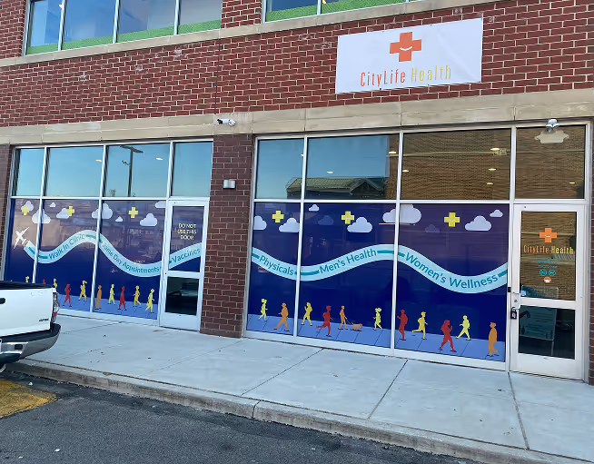
All wayfinding signs on your campus need to have a cohesive color scheme, font, and appearance, and these should match any branding that you already have established. You can also use color to help identify places or group together similar locations.
Beyond basic readability, consistency is what makes a wayfinding system work. When every sign feels like part of the same family, visitors naturally learn how to interpret the system as they move through the space. This reduces hesitation at decision points like hallways, intersections, and building entrances.
Contrast is another important design factor. Text should stand out clearly against its background, and symbols or arrows should be simple and universally understood. Overly decorative fonts or cluttered layouts may look interesting up close, but they can slow down comprehension in real-world conditions where people are walking or driving by.
Using Directional Signs
Generally, the first step to planning your directional signs is to determine how many entrances your campus has. Next, you need to create a tangible path to each building from each entrance. It’s a good practice to make these signs easy to adjust in case of future construction, adding or removing departments, or other changes.
Directional signs are the backbone of any wayfinding system. They guide visitors step-by-step through a property, reducing uncertainty at key decision points. These signs often use arrows, short labels, and clear hierarchy so people can quickly scan and continue moving without stopping.
Good directional planning also takes real behavior into account. People don’t always follow the “ideal” route on a map, so signs should be placed where decisions actually happen, not just where a layout looks neat on paper. Intersections, elevators, parking exits, and main walkways are all critical placement points.
Flexibility is also important. Buildings evolve, departments move, and layouts change over time. Designing directional signs with replaceable panels or modular systems makes updates easier and less expensive in the long run.
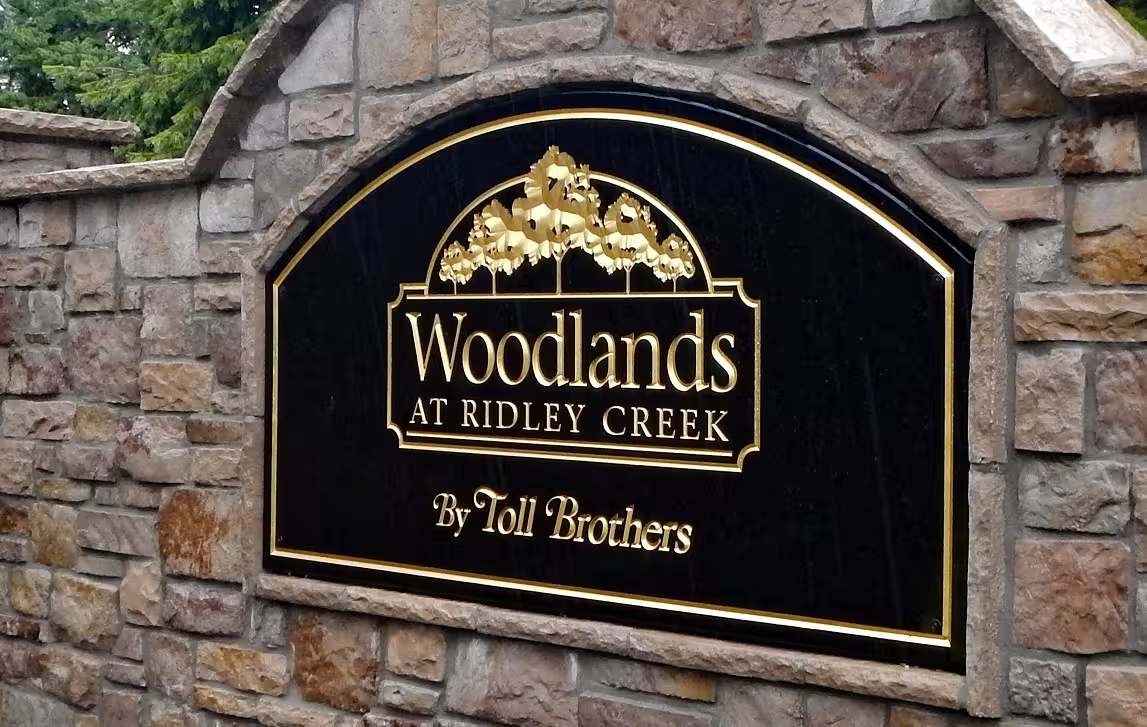
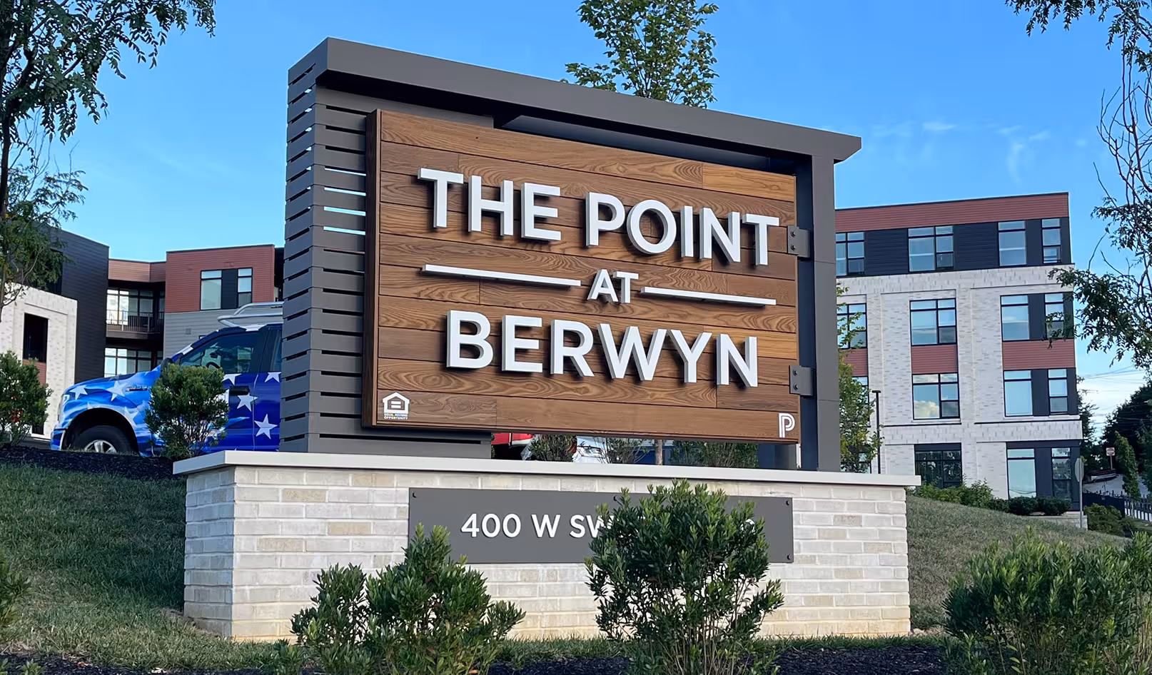
Using Identification Signs
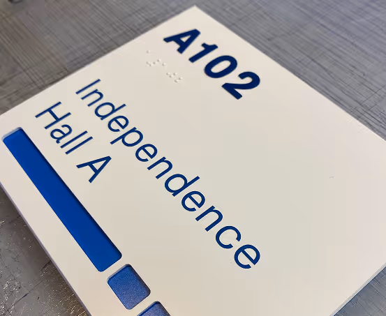
Identification signs don’t directly guide clients along a route, but rather they identify landmarks. Similar to the big red arrows on maps that say, “you are here,” these signs help orient customers. It’s crucial that your visitors are able to determine which building or room they’re standing in front of, so it’s wise to label each with an identification sign.
These signs are often the most frequently used in a wayfinding system because they confirm location. Even when someone already knows where they are going, identification signs provide reassurance that they have arrived at the correct place. This reduces uncertainty and helps prevent missed appointments or confusion.
On larger campuses, identification signs also help create a mental map of the space. When buildings are clearly labeled and consistent in appearance, visitors can more easily understand how the property is organized, even on their first visit.
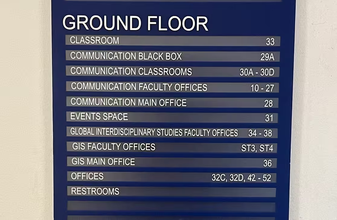
Using Directories
When a client has a meeting or appointment, they will be relieved to see a directory when they walk through the door. These provide a list of offices in your building with details on where to find them.
Directories are especially useful in multi-tenant buildings, medical offices, and corporate lobbies where multiple destinations exist in one location. A well-designed directory should be easy to scan quickly, with logical grouping and clear hierarchy. Alphabetical order is common, but grouping by floor or department can also improve usability depending on the space.
Digital directories are becoming more common as well, allowing for easier updates and interactive navigation. However, printed or mounted directories still play an important role because they do not rely on power or technology and remain accessible at all times.
Help Your Clients Find Their Way on Your Campus
For many businesses, wayfinding signs are necessary to guide clients to their destination within your property. For more information about the wayfinding signs we create at Elmark Sign Company, visit our Wayfinding Signs page, reach out to us online, and/or call us at (610) 692-0525.
Our Signs
Explore custom signs by category and see what's possible.
ADA & Braille Signs
%201.avif)
Acrylic Panel Signs
Carved Signs

Dimensional Letters

LED Illuminated Signs
Monument Signs
Plaques

Vehicle Wraps & Lettering
Wall & Window Vinyl
Wayfinding Signs
Let Us Make Your Perfect Sign
Main Office

Tell us about your project