
Common Mistakes That Make Business Signs Hard to Read
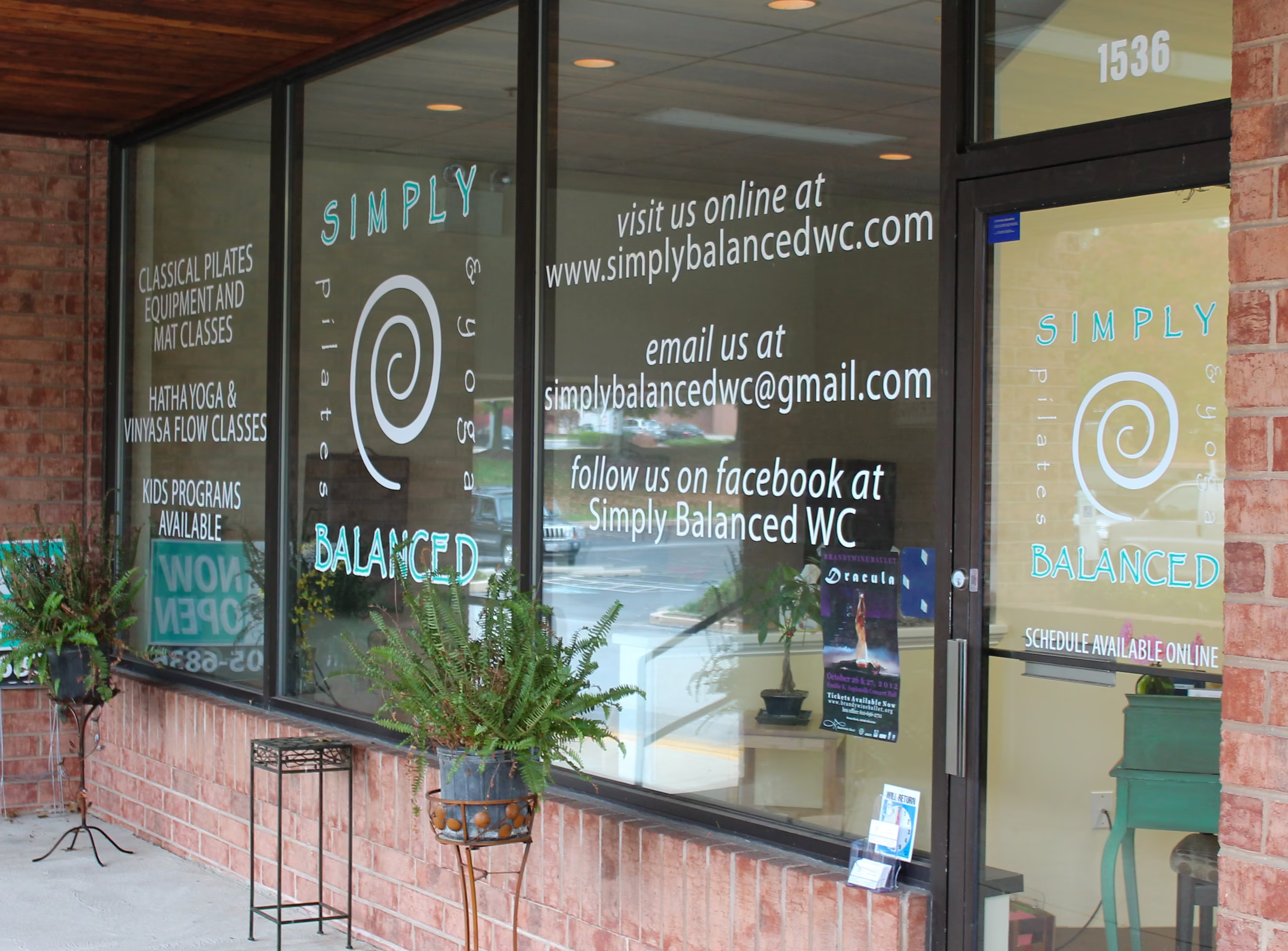
A business sign is often the first impression customers have of a company, and its primary job is simple: communicate clearly. When a sign is hard to read, it fails at its core purpose, no matter how creative or expensive it may be. Poor readability can lead to missed opportunities, reduced foot traffic, and weakened brand recognition. Many businesses unintentionally make design and installation choices that reduce clarity. Understanding the most common mistakes can help ensure your signage works effectively and attracts the attention it deserves.
Overcrowding the Design with Too Much Information
One of the most frequent mistakes is trying to include too much information on a single sign. Businesses often feel compelled to list services, phone numbers, slogans, website addresses, and promotional messages all at once. However, when a sign is overloaded, viewers cannot process it quickly, especially from a distance or while in motion.
A cluttered layout reduces readability because the eye does not know where to focus first. Instead of communicating a clear message, the sign becomes visually overwhelming. In most cases, a business name and logo are enough for exterior signage, while additional details can be placed on supporting materials or secondary signs.
Simplifying the message helps create stronger impact. A clean, focused design allows customers to recognize the business instantly, which is the primary goal of any storefront sign.
Poor Font Choices and Illegible Typography
Typography plays a major role in how easily a sign can be read. One common mistake is using overly decorative, script, or stylized fonts that may look appealing in design software but become unreadable when installed outdoors. Thin or overly compressed lettering can also disappear from a distance or blend into the background.
Another issue is inconsistent font usage. Mixing multiple font styles on a single sign can create confusion and reduce visual harmony. A strong sign typically uses one or two complementary fonts that are bold, clear, and easy to read at a glance.
Choosing the right typeface ensures that customers can understand your message quickly. Simple sans-serif fonts or bold serif styles often perform best for outdoor signage because they maintain clarity in various lighting and weather conditions.
Low Contrast Between Text and Background
Color contrast is essential for readability, yet many signs fail because the text does not stand out clearly from the background. When colors are too similar in tone or brightness, the message becomes difficult or even impossible to read from a distance. For example, light gray text on a white background or dark blue on black can significantly reduce visibility.
Lighting conditions also affect contrast. A sign that looks readable during the day may become hard to see at dusk, night, or in poor weather. Without sufficient contrast, even a well-designed logo or message loses its impact.
High-contrast combinations, such as black and white or yellow and dark blue, improve visibility in nearly all environments. Prioritizing contrast ensures your sign remains effective throughout the day and across changing conditions.
Incorrect Sign Size and Placement
Even a well-designed sign can fail if it is the wrong size or poorly positioned. Signs that are too small may be overlooked entirely, while signs placed too high or too low can fall outside a viewer’s natural line of sight. Placement must account for how customers approach the business, whether by car or on foot.
Obstructions also play a role in visibility. Trees, poles, neighboring buildings, or architectural features can block or partially hide signage. Failing to consider these elements can significantly reduce the effectiveness of the sign.
Proper sizing and placement ensure that the sign is visible from key viewing points. Strategic positioning helps maximize exposure and ensures the message reaches the intended audience without difficulty.
Readable business signage requires thoughtful design, but many common mistakes can reduce its effectiveness. Overcrowding information, using poor typography, lacking color contrast, and choosing incorrect size or placement all make it harder for customers to understand your message. By avoiding these pitfalls and focusing on clarity, contrast, and simplicity, businesses can create signs that communicate quickly and effectively. A well-designed sign not only improves visibility but also strengthens brand recognition and helps attract more customers.
Ready to connect with a sign design specialist? Give us a call at (610) 692-0525 or tell us about your project online.
Our Signs
Explore custom signs by category and see what's possible.
ADA & Braille Signs
%201.avif)
Acrylic Panel Signs
Carved Signs

Dimensional Letters

LED Illuminated Signs

Monument Signs
Plaques

Vehicle Wraps & Lettering

Wall & Window Vinyl
Wayfinding Signs
Let Us Make Your Perfect Sign
Main Office

Tell us about your project