
Simple Tips for Designing a Readable Logo for Signs
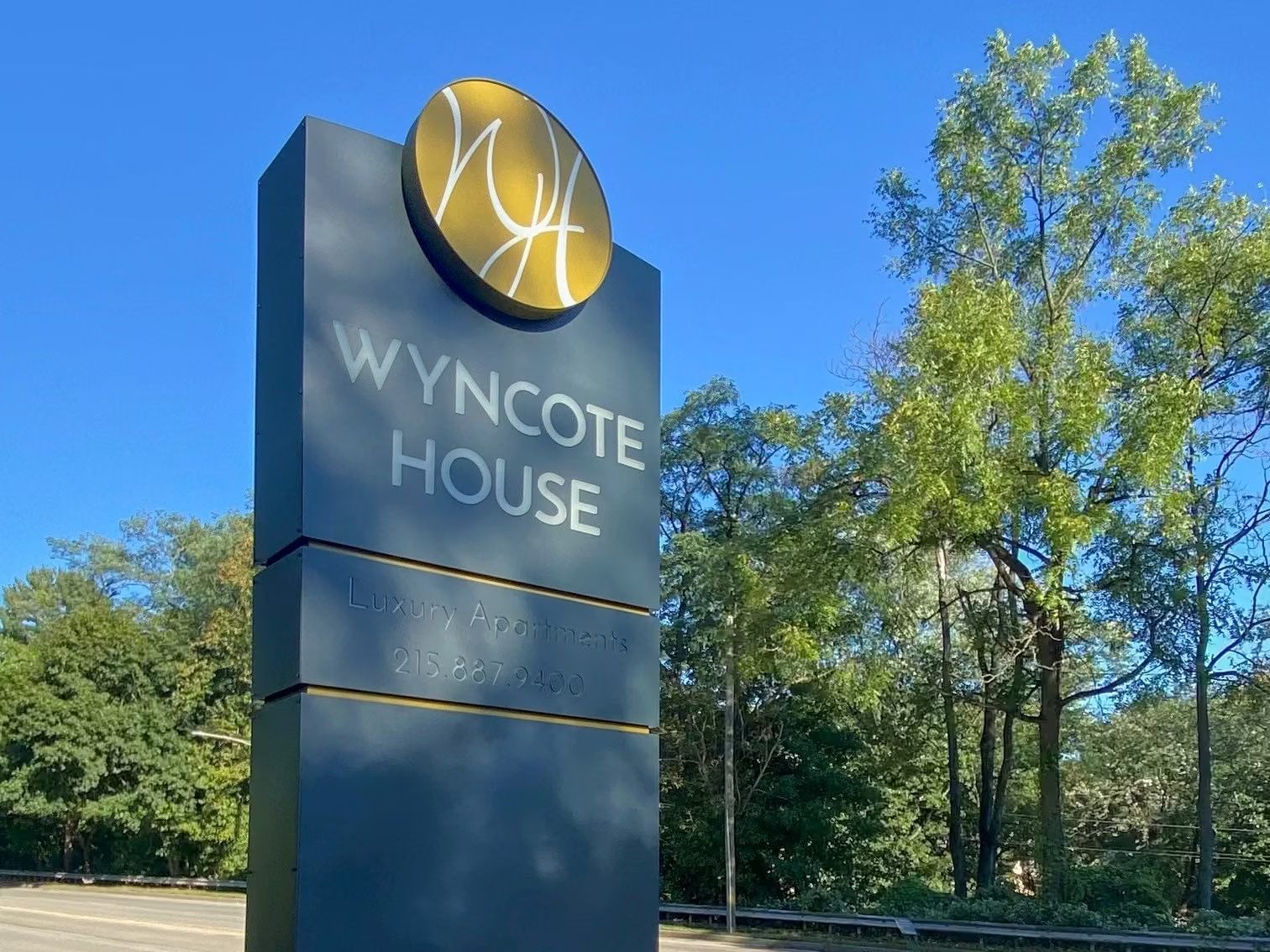
A logo is one of the most recognizable elements of any brand, but when it is displayed on signage, readability becomes just as important as creativity. Whether your sign is mounted on a storefront, vehicle, monument, or billboard, people should be able to identify your business quickly and easily. A well-designed logo for signage combines simplicity, clarity, and strong visual appeal, ensuring that customers can recognize your brand from a distance and remember it long after they have passed by.
Keep the Design Simple and Uncluttered
One of the most important principles of logo design is simplicity. A clean, uncluttered logo is easier to recognize and remains effective across different sign sizes and materials. Avoid adding excessive details, intricate patterns, or multiple graphic elements that can become difficult to distinguish when viewed from a distance.
Simple logos also scale more effectively. Whether your logo appears on a large building sign or a small directional sign, the design should remain clear and recognizable. Limiting unnecessary design elements helps maintain consistency and ensures your brand is instantly identifiable in any setting.
Choose Readable Fonts and High-Contrast Colors
Typography plays a major role in logo readability. Decorative or overly stylized fonts may look attractive on a computer screen but can become difficult to read when installed on outdoor signage. Select clean, bold typefaces that remain legible from various viewing distances and angles.
Color selection is equally important. High-contrast combinations, such as dark lettering on a light background or light lettering on a dark background, improve visibility in different lighting conditions. Avoid using colors with minimal contrast, as they can reduce readability, especially during early morning, evening, or adverse weather conditions.
Testing your logo in both color and black-and-white formats can also help ensure it remains recognizable regardless of printing method or lighting environment.
Design with Viewing Distance in Mind
Unlike logos used primarily on websites or business cards, signs are often viewed from significant distances or by people moving past in vehicles. Every element of your logo should be designed with this viewing context in mind. Large lettering, bold shapes, and minimal fine detail make it easier for customers to recognize your business quickly.
Spacing also contributes to readability. Adequate space between letters, symbols, and graphic elements prevents the logo from appearing crowded. Balanced proportions allow viewers to process the information more easily, improving brand recognition even during brief viewing opportunities.
Before finalizing your design, consider creating mockups at different sizes and viewing distances. This helps identify any details that may become difficult to see once the logo is installed on a sign.
Prioritize Versatility Across Different Sign Types
A successful logo should work well across a variety of signage applications. Your design may appear on illuminated channel letters, monument signs, window graphics, banners, vehicle wraps, and interior displays. Creating a versatile logo ensures it maintains its visual impact regardless of the sign format.
Using scalable vector artwork allows your logo to be enlarged without losing quality or sharpness. It is also beneficial to have both horizontal and vertical versions of your logo, along with simplified variations for smaller spaces. This flexibility helps maintain brand consistency while adapting to different signage requirements.
Working with professional sign designers during the logo development process can also improve the final result. Their understanding of fabrication methods, materials, and installation considerations ensures your logo performs well in real-world applications.
Designing a readable logo for signs requires balancing creativity with practicality. By keeping the design simple, selecting legible fonts and high-contrast colors, considering viewing distance, and ensuring versatility across different sign types, businesses can create logos that effectively communicate their brand. A clear and memorable logo not only enhances the appearance of your signage but also strengthens customer recognition and contributes to long-term business success.
Ready to connect with a sign design specialist? Give us a call at (610) 692-0525 or tell us about your project online.
Our Signs
Explore custom signs by category and see what's possible.
ADA & Braille Signs
%201.avif)
Acrylic Panel Signs
Carved Signs

Dimensional Letters
LED Illuminated Signs
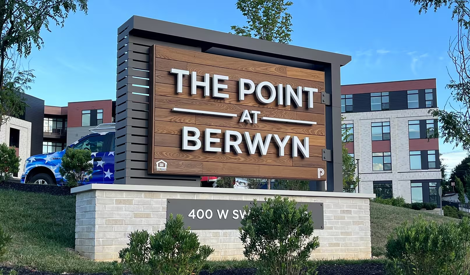
Monument Signs
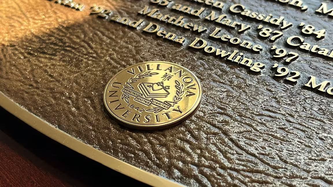
Plaques
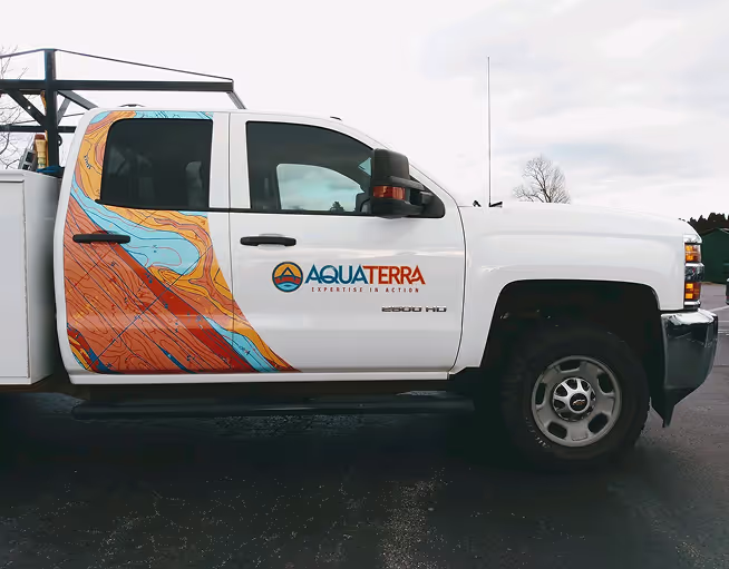
Vehicle Wraps & Lettering

Wall & Window Vinyl
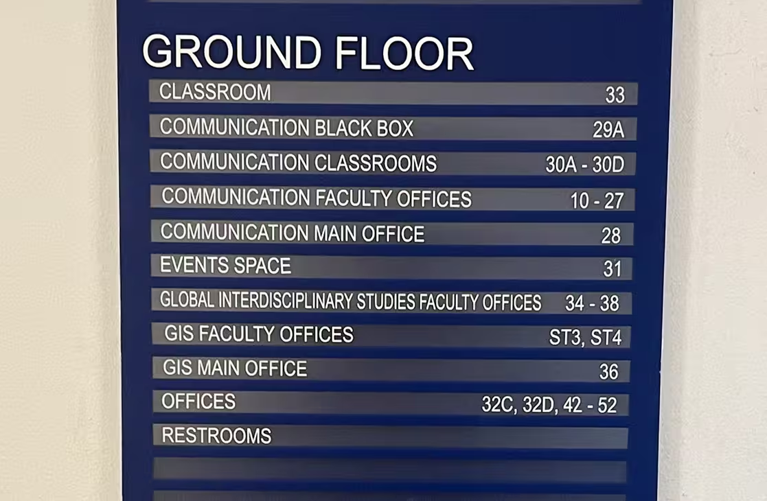
Wayfinding Signs
Let Us Make Your Perfect Sign
Main Office

Tell us about your project